|
|
|

Mass vs. precision graphThe mass vs. precision graph is controlled from the main window by depressing the graph button. The size and position of the graph is ‘remembered’ by the program between sessions. |
||||||
 |
||||||
|
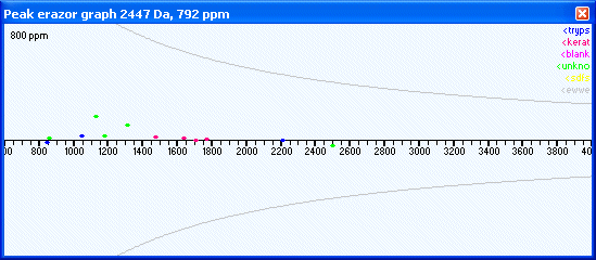
The graph shows at the top left corner the precision (in this case +/- 800 ppm) and in the top right corner a legend explaining the color of the dots. Groups of colored dots can be turned on/off by checking/unchecking the correspoding check-boxes in the contaminant group box (main window) and individual spots by checking/unchecking the mass values in the mass list. The x-axis displays the mass values (m/z) while the y-axis shows the deviation (in ppm). When moving the mouse across the graph, the position of the cursor is shown in the title bar. Identified mass values from the table of the main window are shown as dots, colored according to the top right legend (the color can be set in the setup). The two gray sloping lines represent +1 and -1 Da. These lines can be useful if any dots ends up on this line after calibration it may indicate a wrongly assigned isotope or a deamidation that may be worth checking. You can zoom a portion of the graph by right-clicking on one end of the selected region (a gray vertical line will be shown) and then right-click on the other end of the wanted region. The graph will now zoom to the selected region. Double-click the left mouse button anywhere in the graph, and it will be reset to default conditions (m/z 600-4000). Calibration examples: |
||||||
|
Site last updated: February 14, 2025 |
||||||